Top 10 Web Design Trends for 2019
In some years, design trends have pushed towards rampant creativity—abandoning grids and traditional stock photos for vibrant illustrations, bold color schemes and asymmetrical layouts. Other years, technological advancements have led to websites becoming smarter, with machine learning and subtle interactions, and those shifting paradigms have driven design trends (hamburger menus, anyone?). 2019 web design trends will see these two sides of the coin—aesthetics and technology—come together like never before.
Gathered here are the dominating web trend predictions for 2019, but this is by no means the last word on creative innovation. Because if there’s one thing we can say for certain about 2019, it is the last call for web designers to make their mark on the decade.
- Serifs on screen
- Black-and-white palettes
- Natural, organic shapes
- Glitch art
- Micro-interactions
- Chatbots evolve
- Even more video content
- Minimalism
- Thumb-friendly navigation
- Diversity
1. Serifs on screen
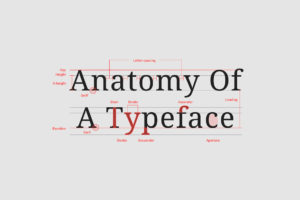
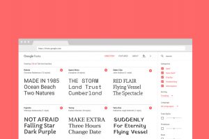
While sans, with its clean readability, is still the go-to for longer bouts of website copy, more and more brands are turning towards bold serifs in other aspects of their designs such as headers and callouts. There’s a good reason for this: serifs were designed to be decorative, making them perfect for emphasis.
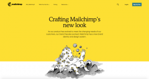
And even though serifs are often associated with the past, they have lots of character and are more adaptable than you might think. Take for example the rounded serifs that play into Mailchimp’s cheerful branding. Or the wedge serifs and bold strokes that create a modern look for Medium.

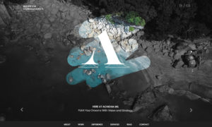
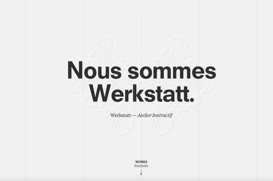
2. Black-and-white palettes
Color is literally how we see the world by light particles being absorbed. When color is missing, we begin to see the world differently: textures and shapes become clearer, and the world seems noticeably slower.
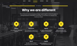
White by itself is clean and reserved whereas black is strong and assertive. Combine these and you get an altogether striking look.
Ironically, the biggest effect black-and-white designs can have is in their combination with minimal amounts of color. Adding an accent color will not only break up the sea of monochrome but will make points of interest and calls-to-action leap out.
3. Natural, organic shapes
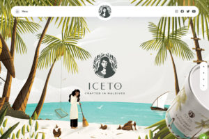
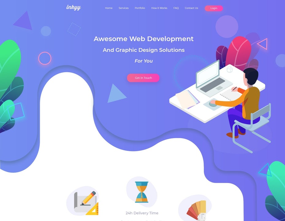
Because organic shapes are naturally imperfect and asymmetrical, they can provide depth to a web design that makes page elements stand out. They are based in nature (think of the curving forms of trees and hills), but free-drawn elements can capture the spontaneity of man-made accidents such as paint splatter. The goal here is for web designs to feel human and alive through the illusion of movement.
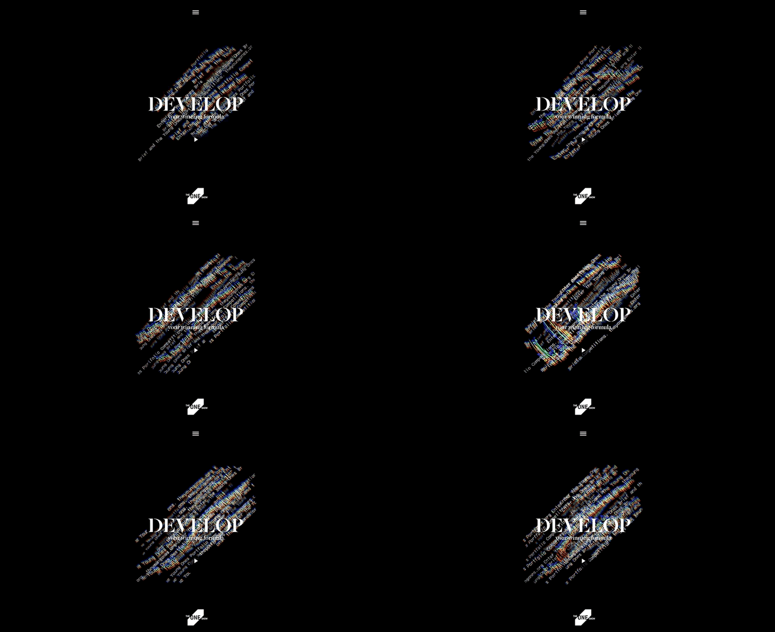
4. Glitch art
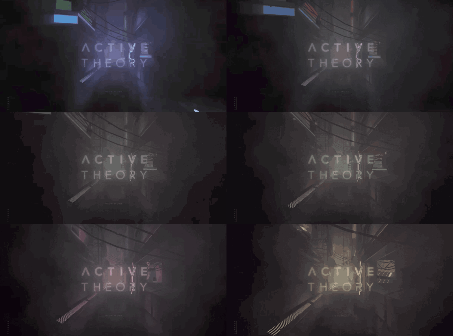
Glitches are significant in our modern times when computers are so pervasive. We fear the machines taking over, but we also don’t know what we’d do without them. Hence, the breakdown of technology makes for appealing subject matter both as an idea and in its design execution, where it can draw the viewer’s eye to those parts of the site that are warped, double exposed and glitchy. It’s a strange, futuristic time we live in, and no one is quite sure where it is all heading. Glitch art amplifies this feeling of disorientation by giving websites a distinctly psychedelic look.
5. Micro-interactions
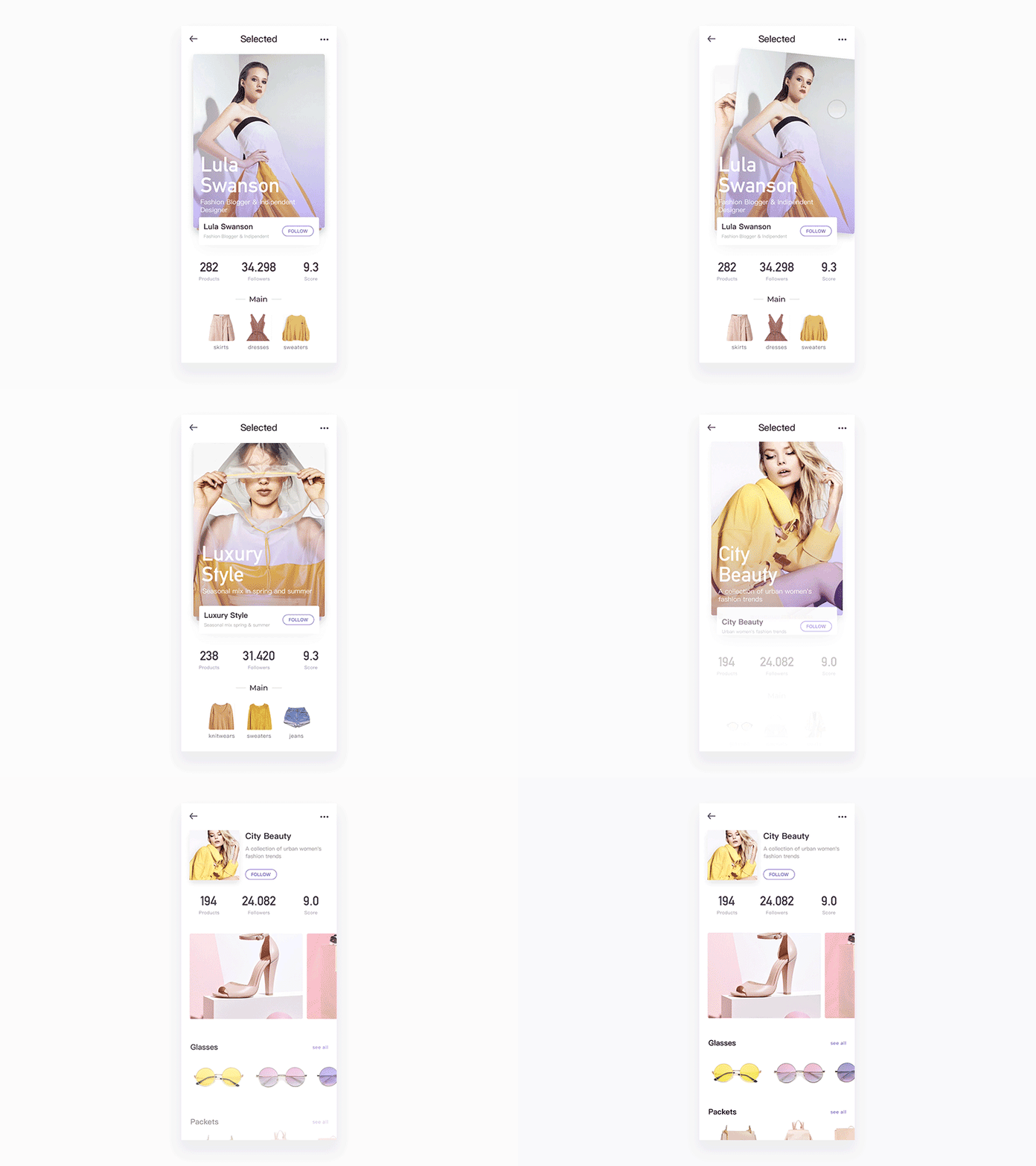
These have been the most common uses of them, but in 2019, web pages will heavily feature their more interactive incarnations. Hover and scrolling animations, chimes, and much more. All in all, this is a way to involve your audience in your website, to subtly transmit information to the users about their actions and usage, and make web pages feel a little smarter.
6. Chatbots evolve
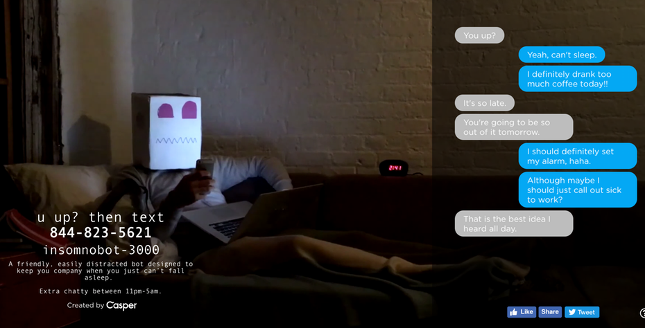
The new chatbots will be showing up more and more on web pages with higher levels of customization than we’ve seen in past iterations. Bright colors will make them not only more prominent on the page but more inviting. We can also predict an influx of friendly mascots to represent brands and give these bots a personable face.
7. Even more video content
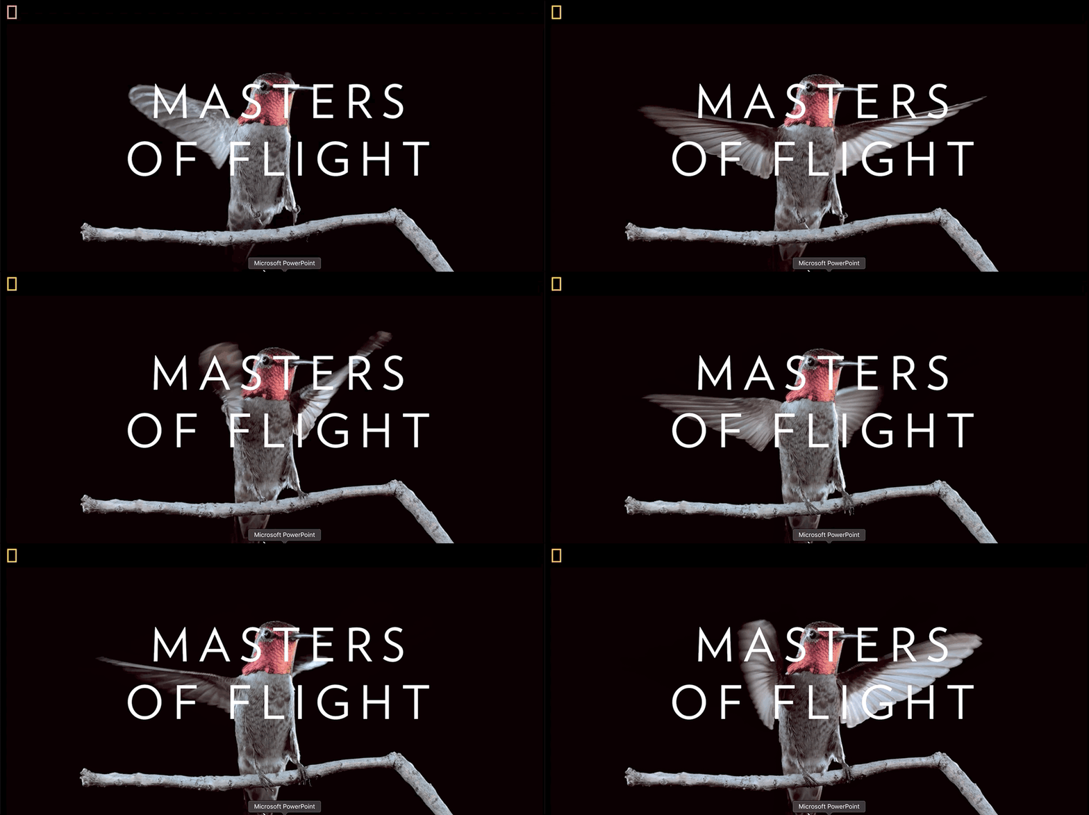
What is new is the move Google has made toward mixed search page results, featuring video content above standard web pages. This has led websites to prioritize video production in order to make themselves easily searchable and offer content in the most efficient, shareable way.
8. Minimalism
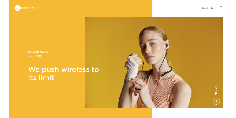
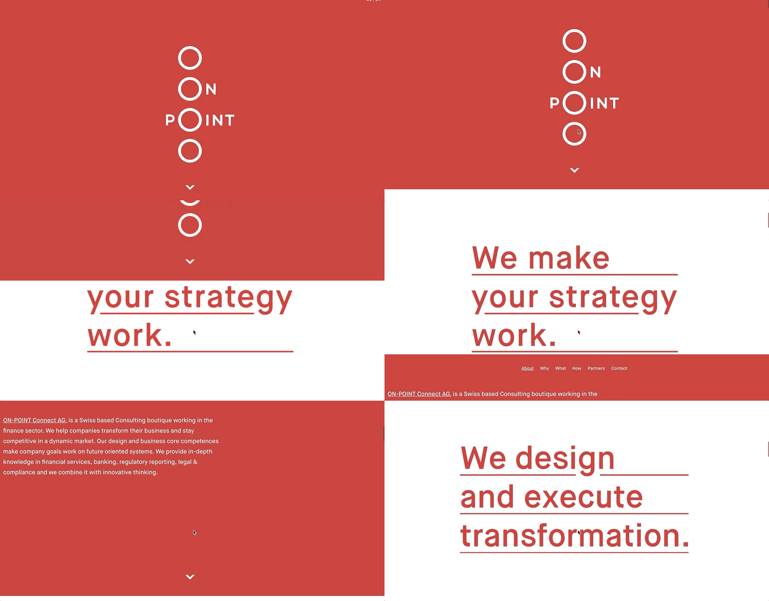
Minimalism will continue to dominate the digital landscape in 2019. Animations and fade-in effects that make scrolling more engaging will give web pages freedom to space out their content and thus result in more whitespace, contrast and clear typography without too many distracting elements.
9. Thumb-friendly navigation
10. Diversity
Even small considerations of the past (like Apple’s varying skin tones for emojis) have gone a long way in making people of all walks of life feel a little more welcome in a brand’s digital space. 2019 should see web designers make even bigger leaps towards inclusiveness, from improved accessibility standards to socially conscious and diverse imagery. The world still has a long way to go in this arena, but these designers can use their craft to demonstrate that the web is supposed to be about real people making real connections.
