Improving Your Design With Less
- Shortening the writeups
- Using less elements
- Using uniform designs
- Targeting your content
1. Shortening the writeups
Remove unnecessary words. Shorten run-on-sentences and remove redundant sentences, too. Always have one idea per paragraph. It’s a good form of writing and it’s better for those readers who scan. Finally, and this is true especially of long-form content, use the inverted pyramid structure. Start with the conclusion and add more detail as the content gets longer.

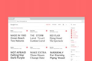
2. Using less elements

3. Using uniform designs

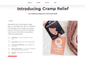
4. Targeting your content
Always have a single and clear goal to aim for. This will help you remove things that distract from it. For example, if you want the user to download a sample chapter of a book, don’t promote another book over the chapter. Showcase the download button front and center. Repeat the Call-To-Action a few times if it’s a long page. And, remove everything that does not help the user download the sample.