Konsälidön is the tipping point ushering in the new era in consulting. Their value comes from connecting consulting teams with clients more effectively than any traditional consulting partnership. They bring transparency and open competition, promoting the brightest and best over the status quo.
SCROLL DOWN

The logo symbolizes the power of together, and has three main components.
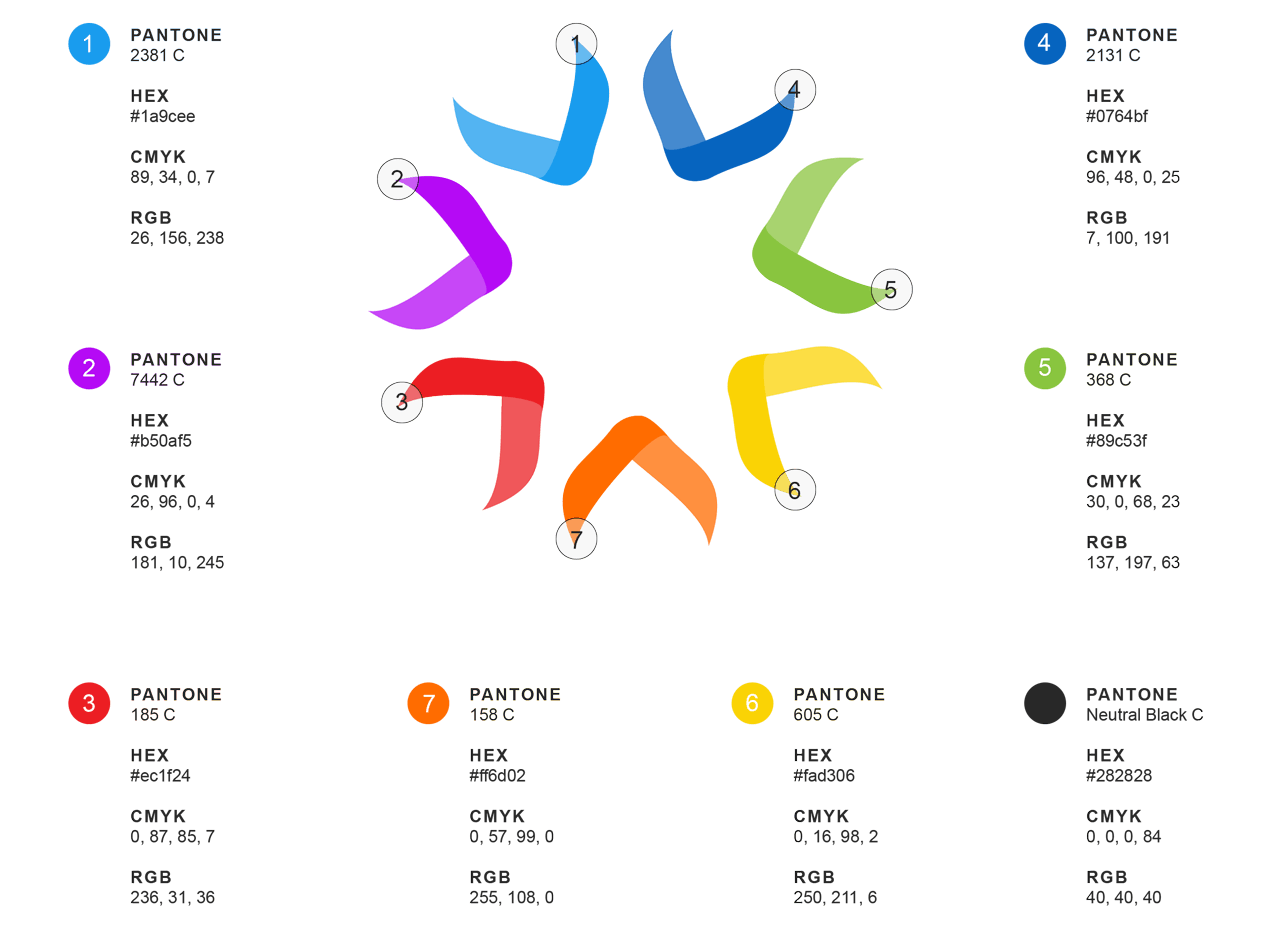
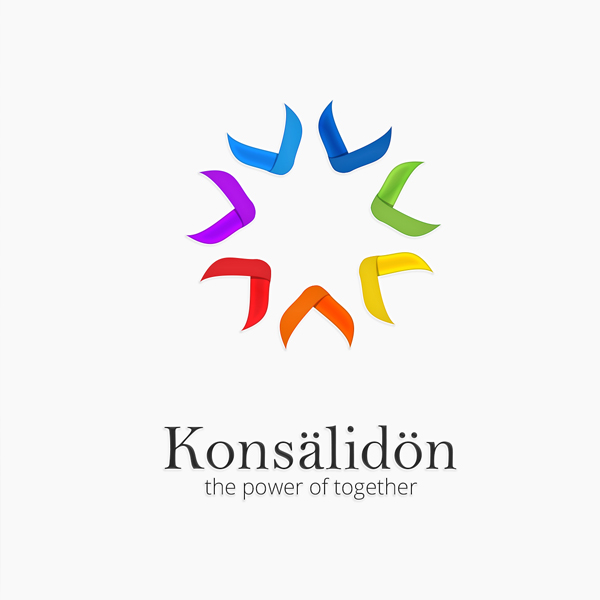
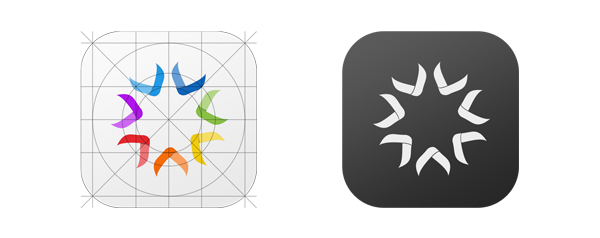
The letter K (from Konsälidön) has been used as a starting point. The individual segments are created using the appendages of the letter K. Each segment represents an industry group that the company services.
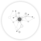
The concept of coming together as a network is represented by the individual segments coming together to form a circle. The segments point inward demonstrating communication between various segments
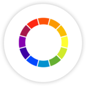
The colors across the VIBGYOR spectrum has been used to signify that they offer services across the full spectrum of consulting disciplines and industry groups.
